My Projects
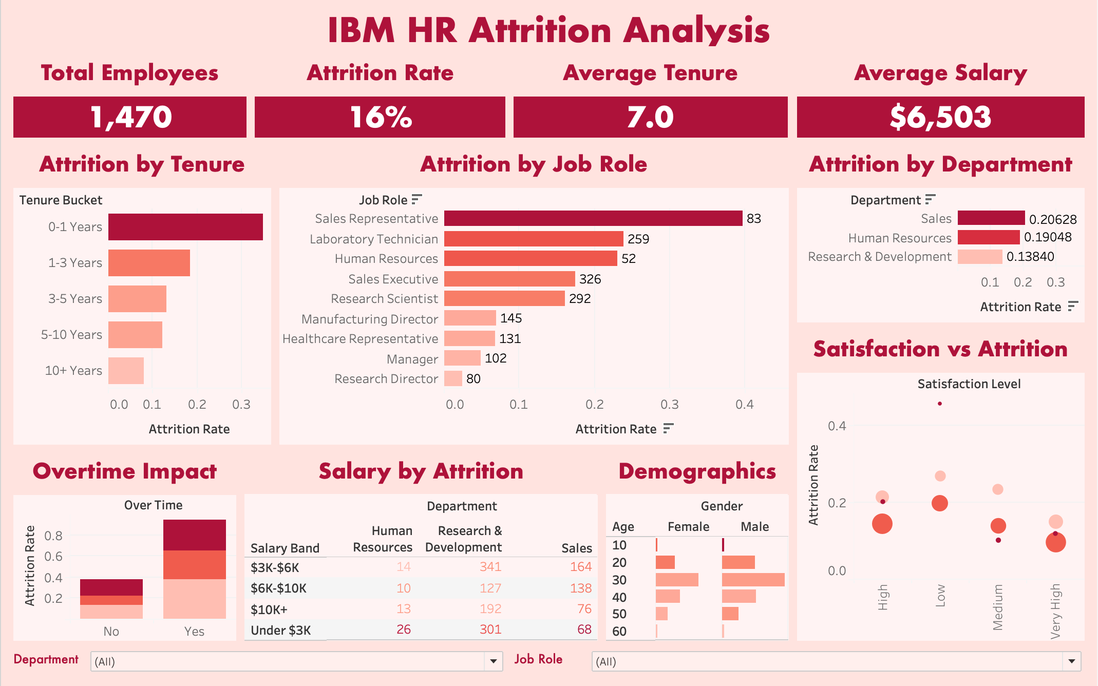
HR Attrition Analysis Dashboard
An interactive Tableau dashboard analyzing employee attrition patterns using IBM's HR Analytics dataset (1,470 employees). The dashboard identifies key drivers of employee turnover to support data-driven retention strategies.
Key Insights:
- Sales Representatives have the highest attrition rate at 40%, nearly 3x the company average
- Employees working overtime leave at significantly higher rates (30%) compared to non-overtime workers (10%)
- New hires (0-1 years tenure) represent the highest flight risk with 35% attrition
- Lower salary bands correlate with increased turnover across all departments
Technical Implementation:
- Built calculated fields for attrition rate, tenure buckets, salary bands, and satisfaction categories
- Designed interactive filters enabling analysis by department and job role
- Created KPI cards displaying total employees, attrition rate, average tenure, and average salary
- Developed heat maps, bar charts, and demographic breakdowns for multi-dimensional analysis

Border Angels EOY Programs Dashboard
Built organization-wide reporting dashboard consolidating annual program data for humanitarian nonprofit serving migrants along the U.S.-Mexico border. Coordinated cross-departmental data collection and engineered Python ETL pipeline to automate monthly reporting, replacing manual processes with real-time KPI tracking.
Key Insights:
- Developed Python ETL pipeline using Pandas to extract, clean, and transform raw program data from multiple departments into standardized reporting format
- Automated data loading through Google Cloud Console integration, enabling monthly refresh cycles without manual intervention
- Consolidated organizational KPIs revealing 27+ community events coordinated with 84+ unique volunteers throughout the year
- Tracked $84,405+ in program expenditures across all initiatives, providing leadership with financial visibility for budget planning
- Quantified community impact showing 1,362+ people served across Border Angels' shelter coordination and humanitarian programs
Project code will not be shared due to data sensitivity
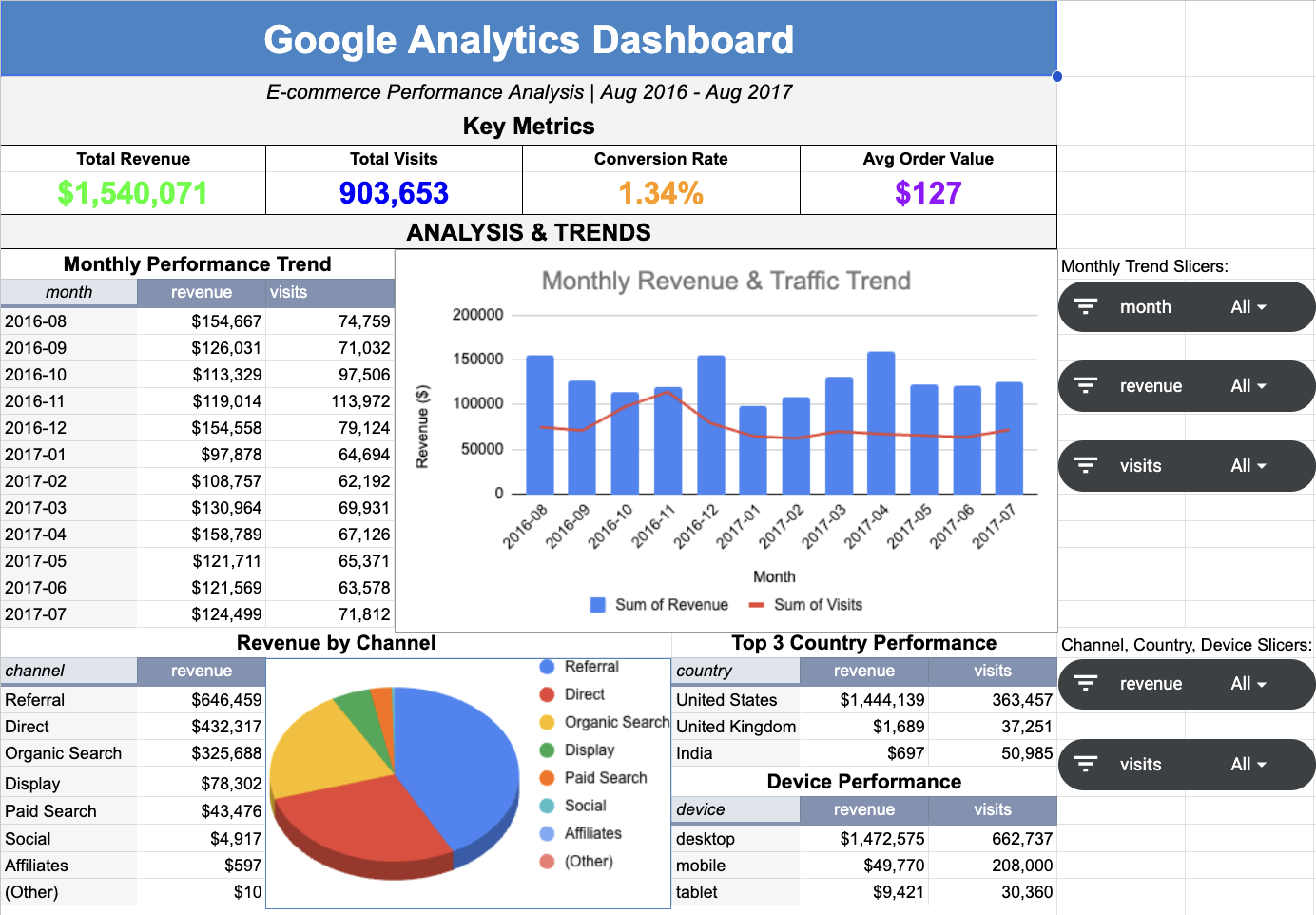
Google Analytics E-Commerce Dashboard
Built self-service analytics dashboard analyzing Google Analytics sample dataset (903,653 sessions, $1.54M revenue, Aug 2016 - Aug 2017). Engineered SQL views with advanced aggregations to enable multi-dimensional analysis of e-commerce performance across marketing channels, device categories, and geographic markets.
Key Insights:
- Designed BigQuery SQL views with UNNEST operations and aggregation functions to analyze 903K sessions across marketing channels, device types, and geographic markets
- Built interactive dashboard with 4 pivot tables and 6 slicers enabling real-time filtering and cross-dimensional performance analysis
- Identified mobile optimization opportunity: desktop generates 95.6% of revenue ($1.47M) while mobile drives 23% of traffic but only 3.2% revenue
- Discovered referral channel drives 42% of revenue ($651K) with highest average order value across all traffic sources
- Analyzed geographic distribution showing United States accounts for 93.8% of revenue with opportunity for international expansion
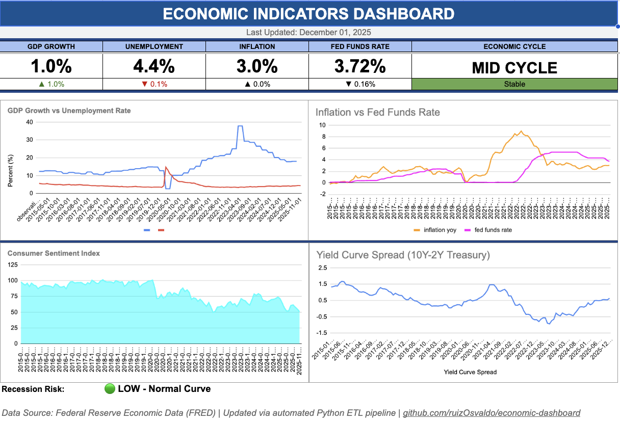
Economic Indicators Analytics Dashboard
Built an automated ETL pipeline and analytics dashboard to track macroeconomic indicators using Federal Reserve Economic Data (FRED) API. Features database storage, automated data refresh, and Google Sheets integration for stakeholder reporting.
Key Insights:
- Automated data extraction from Federal Reserve API for GDP, unemployment, inflation, and interest rate indicators
- Designed normalized PostgreSQL database schema for efficient storage and querying
- Wrote SQL queries for data aggregation, trend analysis, and historical comparisons
- Integrated Google Cloud APIs for automated reporting to Google Sheets
- Visualized economic trends with interactive time-series analysis
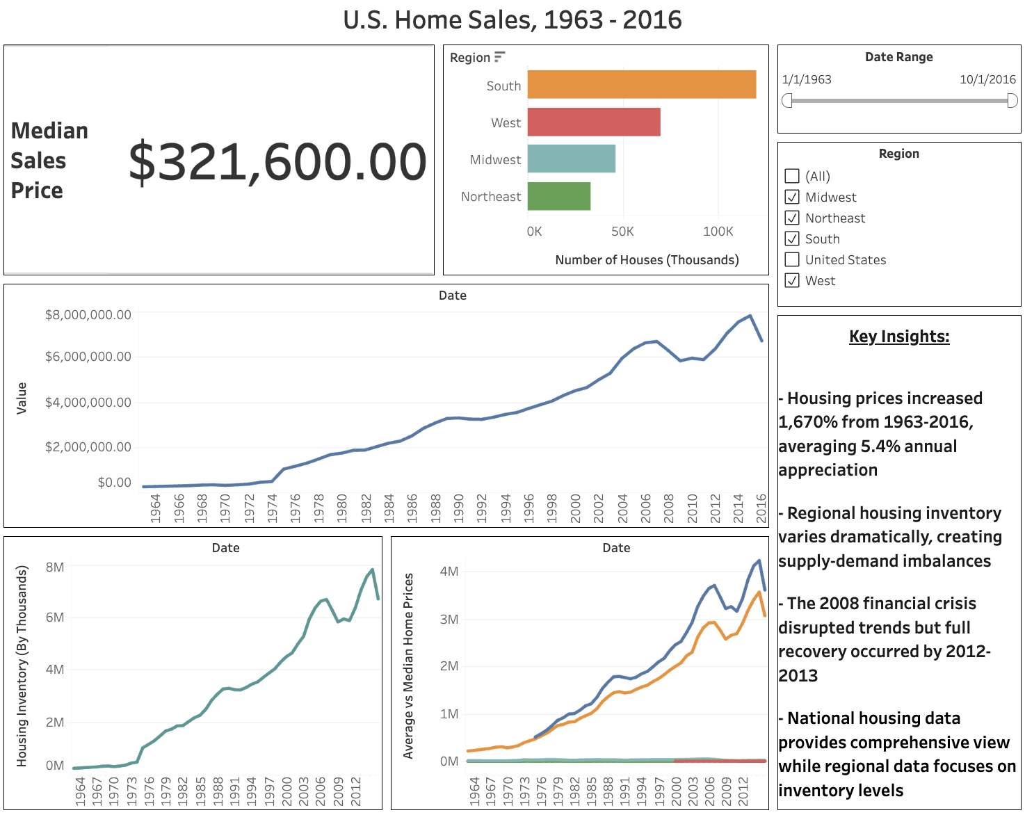
US Housing Market Analysis Dashboard
Built a comprehensive housing market dashboard analyzing 53 years of US Census data (1963-2016) with interactive regional filtering, price trend analysis, and inventory insights. Features national price appreciation tracking, regional comparisons, and economic cycle visualization.
Key Insights:
- Housing prices increased 1,670% from 1963-2016, averaging 5.4% annual appreciation
- Regional housing inventory varies dramatically, creating supply-demand imbalances
- The 2008 financial crisis disrupted trends but full recovery occurred by 2012-2013
- National housing data provides comprehensive view while regional data focuses on inventory levels

Sales Insights Dashboard
Developed an interactive dashboard for visualizing sales data by region, category, and time trends. Enabled dynamic filtering and key performance metrics.
Key Insights:
- Visualized total sales and profits across regions
- Tracked monthly sales trends and seasonal patterns
- Highlighted performance by product category
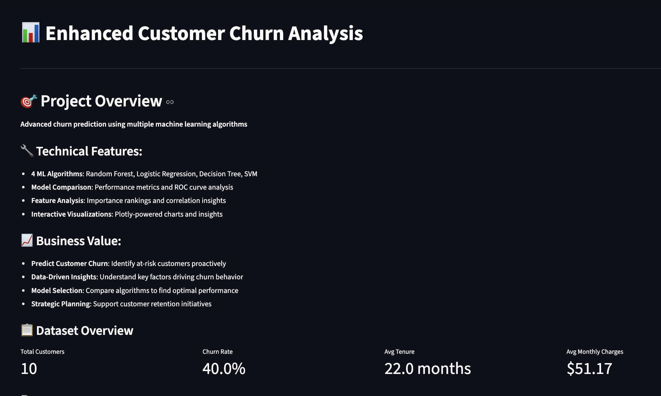
Customer Churn Analysis
Built a machine learning dashboard to identify key factors influencing customer churn in a telecom dataset. Included performance metrics and feature importance visualization.
Key Insights:
- Identified top drivers of churn using Random Forest
- Displayed model performance with classification report and confusion matrix
- Visualized top 10 features contributing to churn
Baseball Performance Analytics
Built an interactive dashboard analyzing MLB player statistics using sabermetrics. Predicts outcomes based on different factors such as opposing pitcher and stadium. Uses a machine learning model to train future predictions with a tracking database.
Work in ProgressSkills Demonstrated
Data Cleaning & Processing
Pandas, NumPy, missing data handling, encoding
Machine Learning
Random Forests, model evaluation, train/test split
Visualization
Matplotlib, Seaborn, Plotly, Tableau
Web Applications
Streamlit dashboards, interactive KPIs
Databases
SQL, PostgreSQL, BigQuery, data extraction
Business Intelligence
KPI development, churn analysis, forecasting